The feature graphic is the Google Play asset everyone uploads last, at midnight, resized from whatever was lying around. Yet it sits behind your promo video, appears in Play's promotional placements, and is mandatory. Here is exactly what Google requires in 2026, and how to make one that earns its slot.
The specs, without ambiguity
- Size: exactly 1024 x 500 pixels. Not a ratio, an exact size.
- Format: JPEG or 24-bit PNG, no transparency.
- It is required to publish your listing, even if you never add a video.
That is the easy part. The part that ruins feature graphics is placement behavior: Play crops and overlays it depending on where it appears.
Design for the safe zone
Two rules cover almost every crop and overlay case:
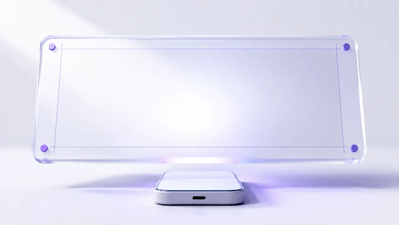
- Keep everything that matters inside the central ~860 x 480 zone. Edges get trimmed in several placements, so logos or text near the borders will eventually be cut.
- Keep the exact center breathable. If you add a promo video, Play stamps the play button right there. A face or wordmark dead-center will sit behind a triangle.
Beyond geometry: treat it like a mini-billboard, not a collage. One visual, a short brand statement, large type if any type at all. Small text is unreadable at the sizes Play renders this asset.
Localize it, it pays
The feature graphic is localizable per language in the Play Console, and it is one of the cheapest localization wins available: reported lifts run 10 to 20 percent in non-English markets just from a translated graphic. If you already localize your screenshots, the feature graphic belongs in the same batch: same design, translated line, exported per language.
Consistency with your screenshots
The graphic and your screenshots appear together on the listing, so they should look like one campaign: same background language, same typography, same palette as your screenshot set. A feature graphic in one style and screenshots in another reads as "assembled from leftovers", which is exactly the amateur signal that depresses conversion.
The short version
1024 x 500, no transparency, essentials inside the 860 x 480 safe zone, center clear for the play button, one bold visual, and translate it for your main markets. It takes an hour to do properly and it is shown in the places where Play decides whether to promote you.