Your store screenshots are the single most important asset in your app marketing. They're what 80% of users see before deciding to install. Here's how to get them right.
Why your screenshots matter more than your icon
When a user lands on your App Store or Google Play page, three signals shape the install decision: the icon, the screenshots, and the rating. Screenshots dominate the visible above-the-fold area on mobile, and they're the most "explainable" surface, you can show features, benefits, and social proof at a glance.
Developer reports and A/B tests on store listings all point the same way: polished, well-localized screenshots measurably lift install rates. If you don't invest in screenshot design, you're leaving installs on the table, every day.
The 5 rules of high-converting screenshots
- Lead with the strongest benefit. Your first screenshot should make the value prop crystal clear in 1.5 seconds. No app chrome alone, always pair the screenshot with a headline that explains what users get.
- Localize, properly. Don't just translate the headline, adapt the example data, the date format, the cultural references. A localized screenshot converts 2-3× better in non-English markets.
- Show flow, not features. Sequence your 5-10 screenshots like a story: "this is what you'll do with it" beats "here are all our features".
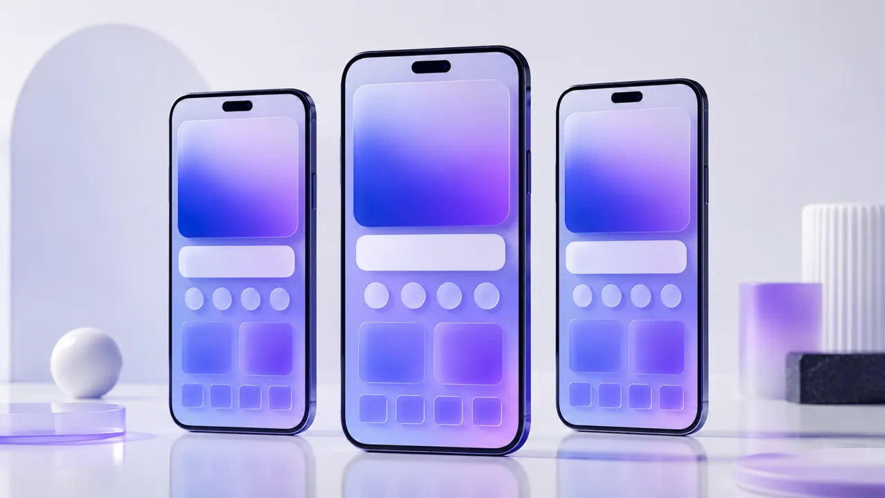
- Use device frames. Screenshots inside an iPhone or Android frame feel native and credible. Raw screenshots look amateur.
- Test, then iterate. A/B test your screenshots regularly. Apple Search Ads now offers product page variants, use them.
The technical specs (App Store & Play Store)
Apple requires 6.7" (1290×2796) and 6.5" (1242×2688) screenshots for iPhone, and 13" (2048×2732) for iPad Pro. You can submit one set per device family, and Apple will scale them down, but submitting native resolution always looks crisper. Google Play accepts a wider range; a safe default is 1080×1920 portrait or 1920×1080 landscape, with at least 2 screenshots.
LookFrame handles all of this automatically, design once at the source resolution, export the full set in one click, named to Apple and Google's file conventions.
Common mistakes that kill your conversion
- Tiny, illegible text. If users can't read your headline on a thumbnail, you've lost them. Always test at the actual thumbnail size.
- Inconsistent style across screenshots. Different fonts, colors or framing between slides signals "amateur app". Build a preset and stick to it.
- Showing the OS chrome (status bar, home indicator). Most pro listings crop these out or use a clean device frame. The status bar at the top is dead pixels for marketing.
- Skipping localization. If you only ship English screenshots, you're ignoring 70% of potential installs globally. Even rough translations beat no translation at all.